Designing Zela — a complete fintech app
A full end-to-end product design of a modern fintech application covering 35 screens across 10 user journey groups — from onboarding to investments.
ROLE
UIUX Designer
TOOL
Figma
SCREEN
35 Screens
OVERVIEW
Project Intro
Zela is a smart money app designed for everyone — from first-time savers to active investors. The goal was to design a full product experience that feels premium, trustworthy, and effortless across every touchpoint.
DESIGN SYSTEM
Brand & colors
Built on a rich green and lemon green palette — bold, energetic, and distinctly Zela.
#
1A4D2E
#
2D7A4F
#
A8D800
#
E8FCA0
#
FFFFFF
#
1C1C1A
#
E8534A
UI FLOW
Every screen, every flow.
35 screens designed across 10 groups — scroll each row to explore.
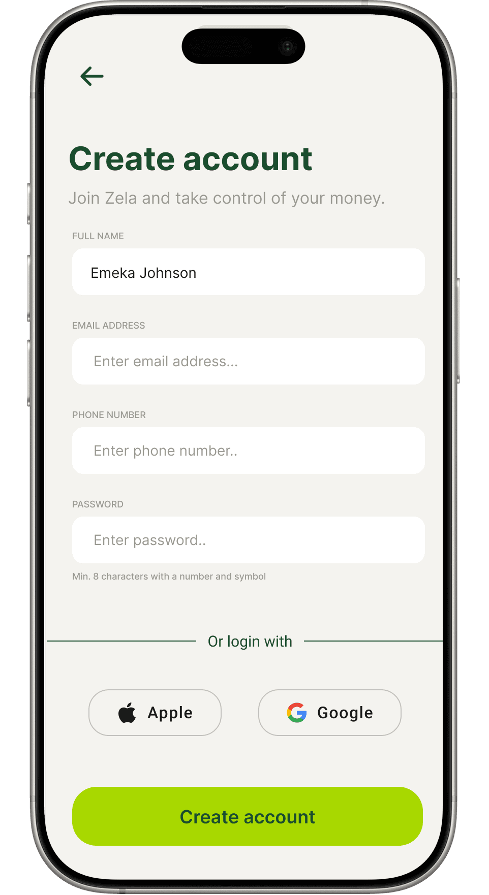
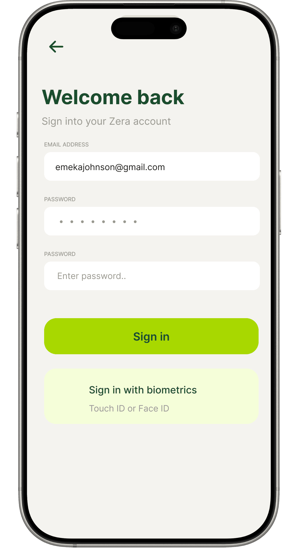
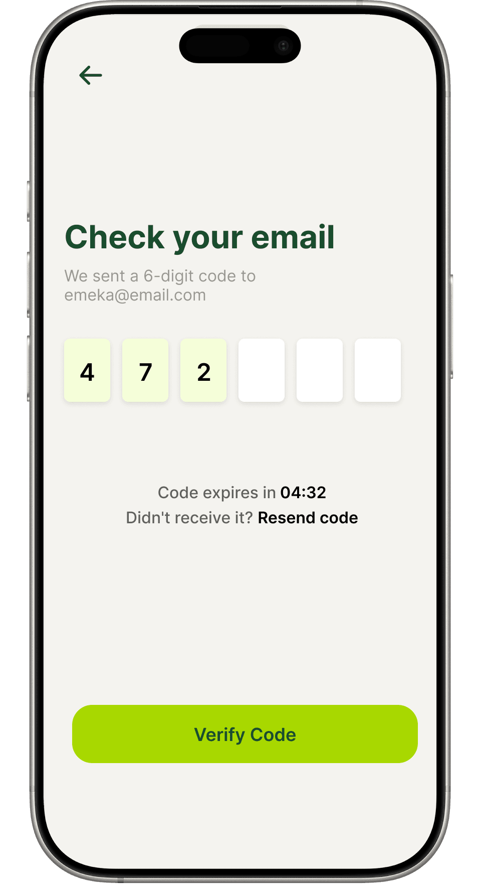
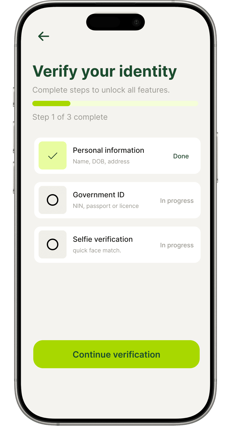
Auth flow
A frictionless first impression
Clean entry points, biometric login, OTP verification and a guided KYC flow that builds trust from the very first tap.
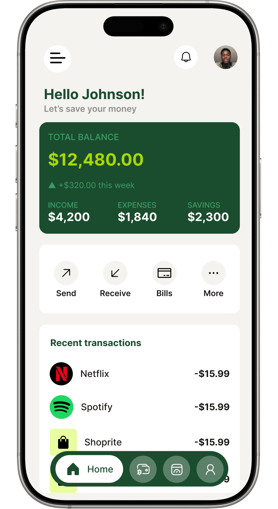
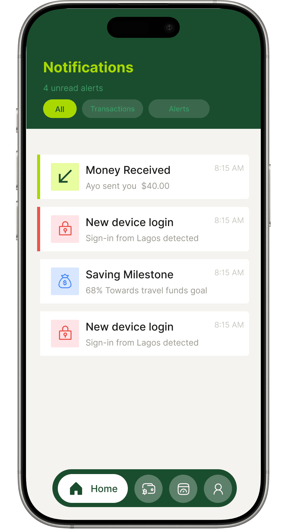
Core app
Everything at a glance
The dashboard surfaces balance, spending trends and recent activity instantly. Notifications keep users informed without overwhelming them.
Payments & transfers
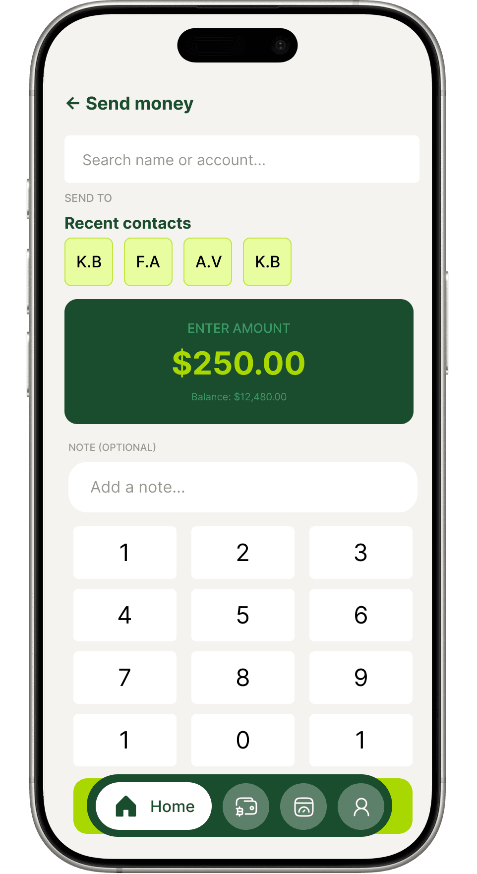
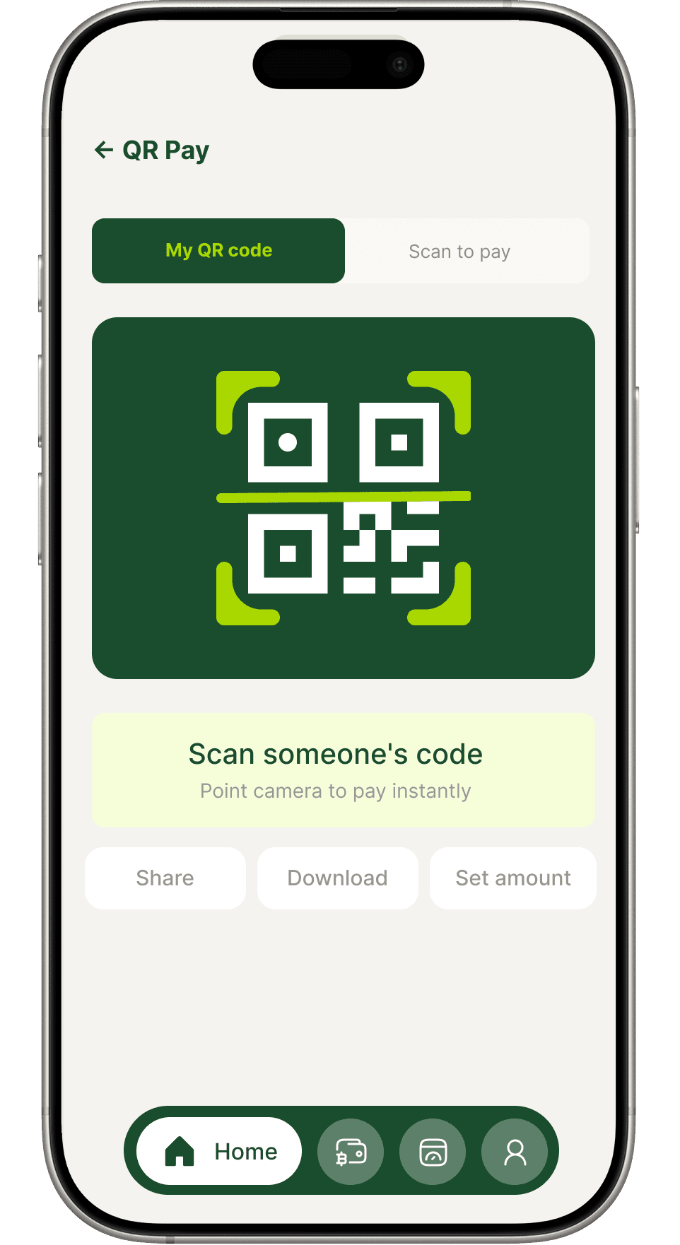
Money moves in seconds
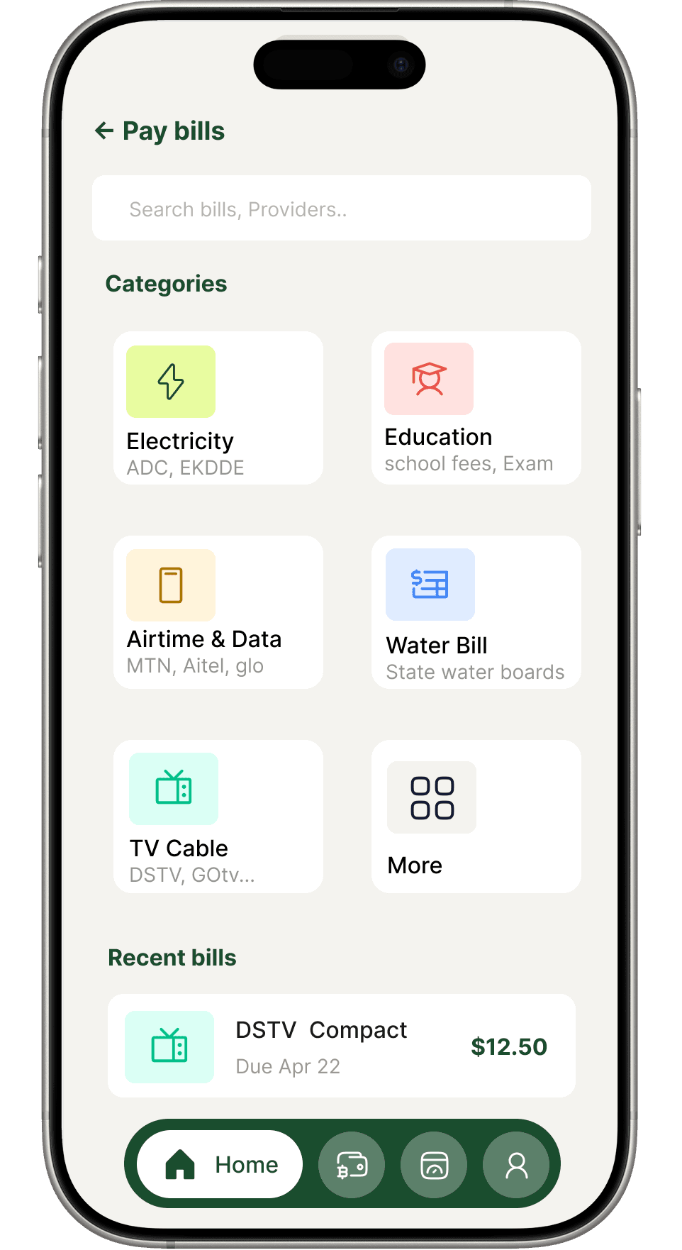
Send, request, scan and pay — built around speed and clarity. Recurring payments handle the routine so users never miss a bill.
Cards
Full control, in your pocket
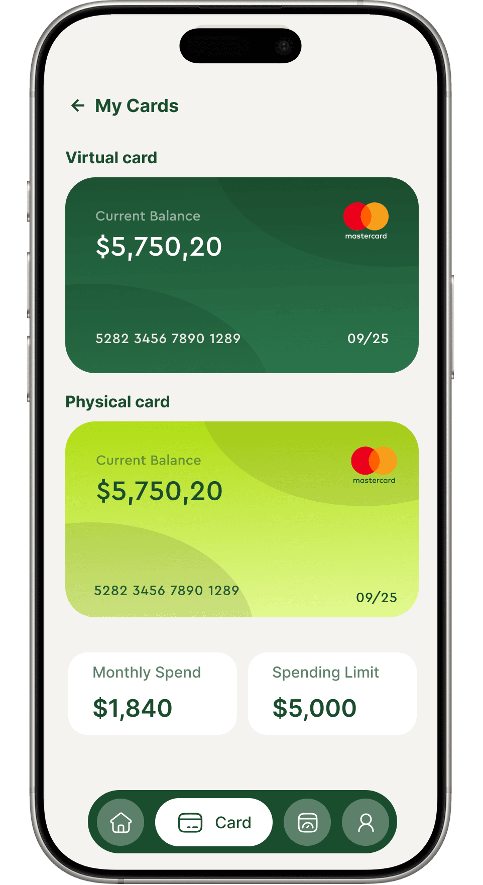
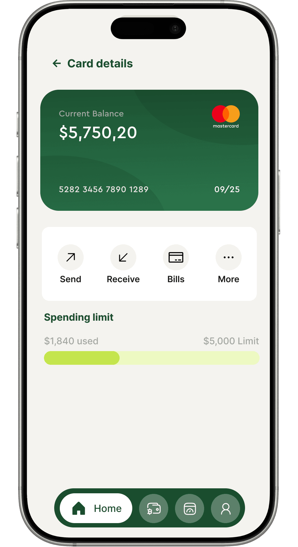
Virtual and physical cards managed from one place. Freeze, set limits, reveal CVV and toggle spend permissions without calling support.
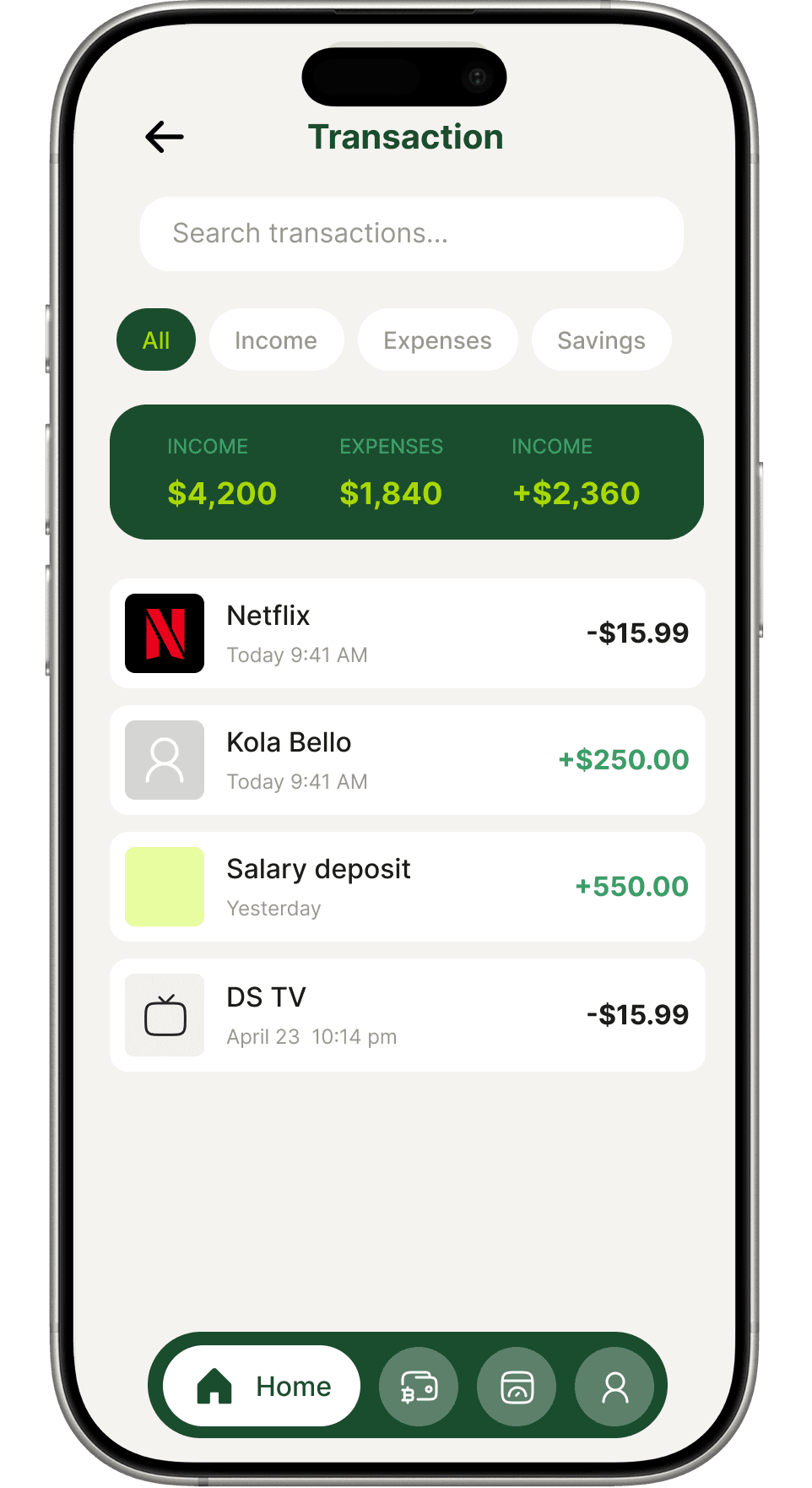
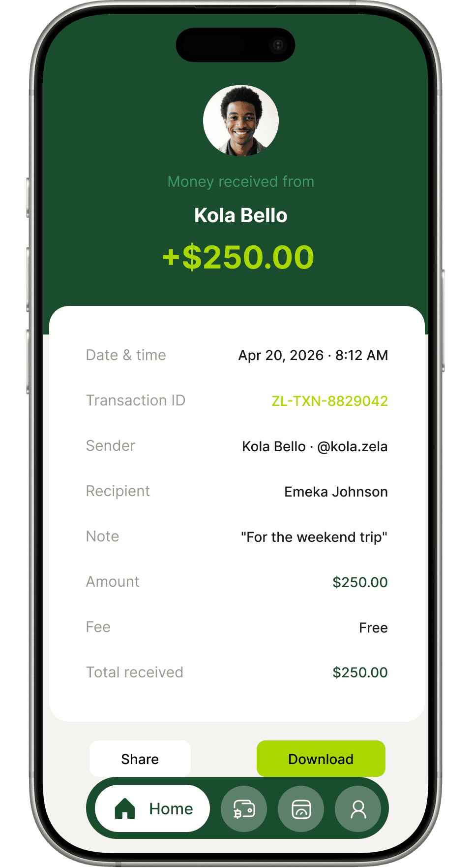
Transactions
Every dollar accounted for
Filterable history with status badges, grouped by date. Each receipt is shareable, downloadable and tells the full story of a payment.
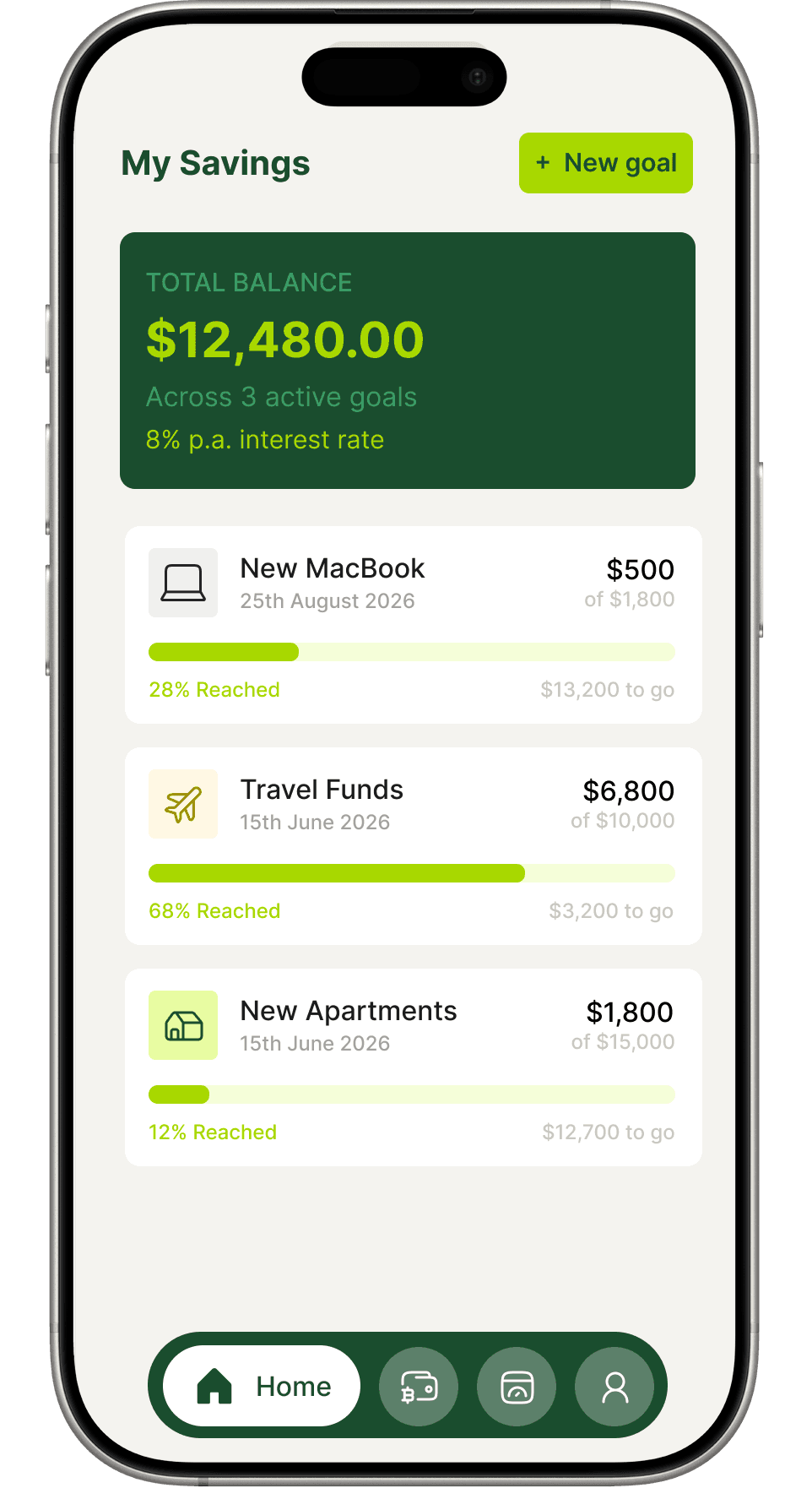
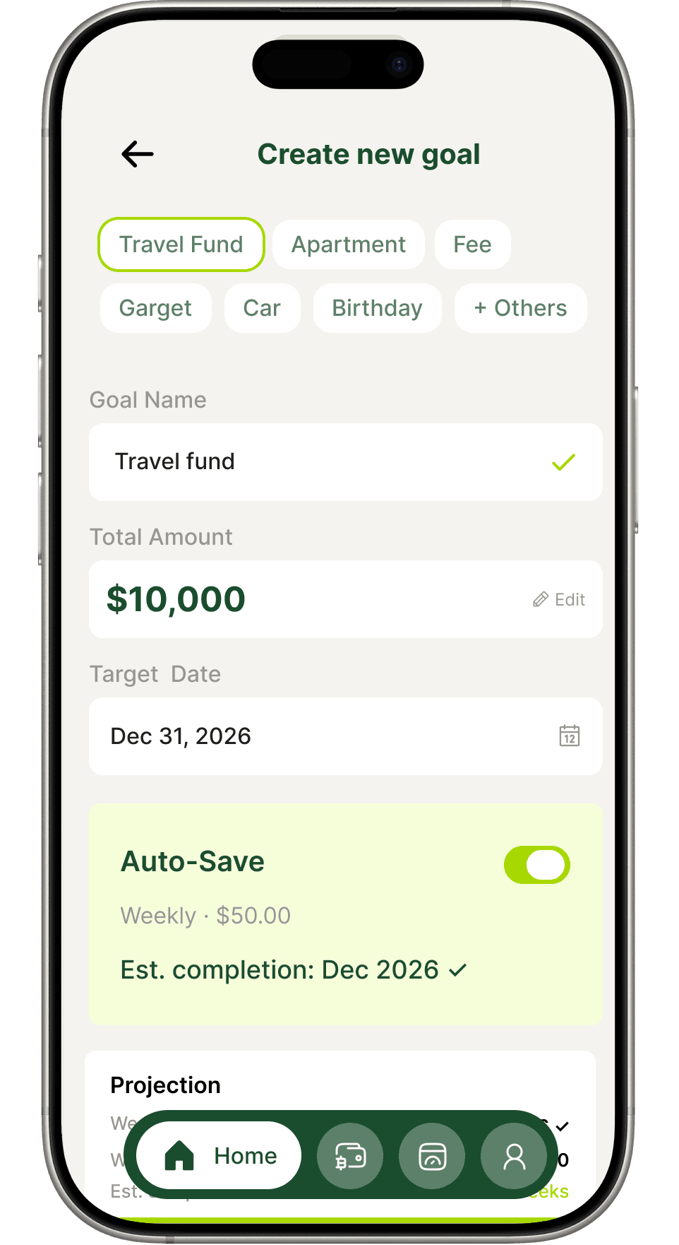
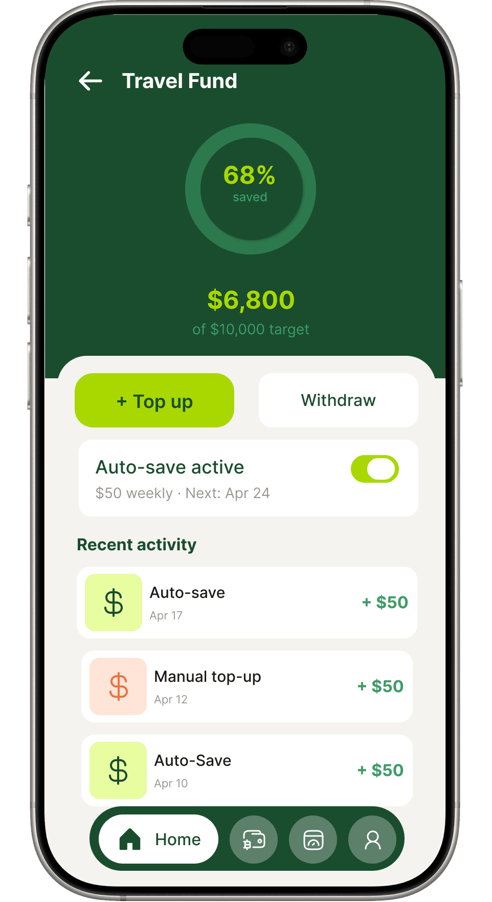
Savings & goals
Save with purpose
Named goals with targets, deadlines and auto-save. Progress rings and projections turn saving from a chore into something worth tracking.
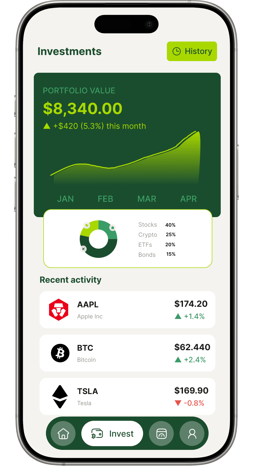
Investments
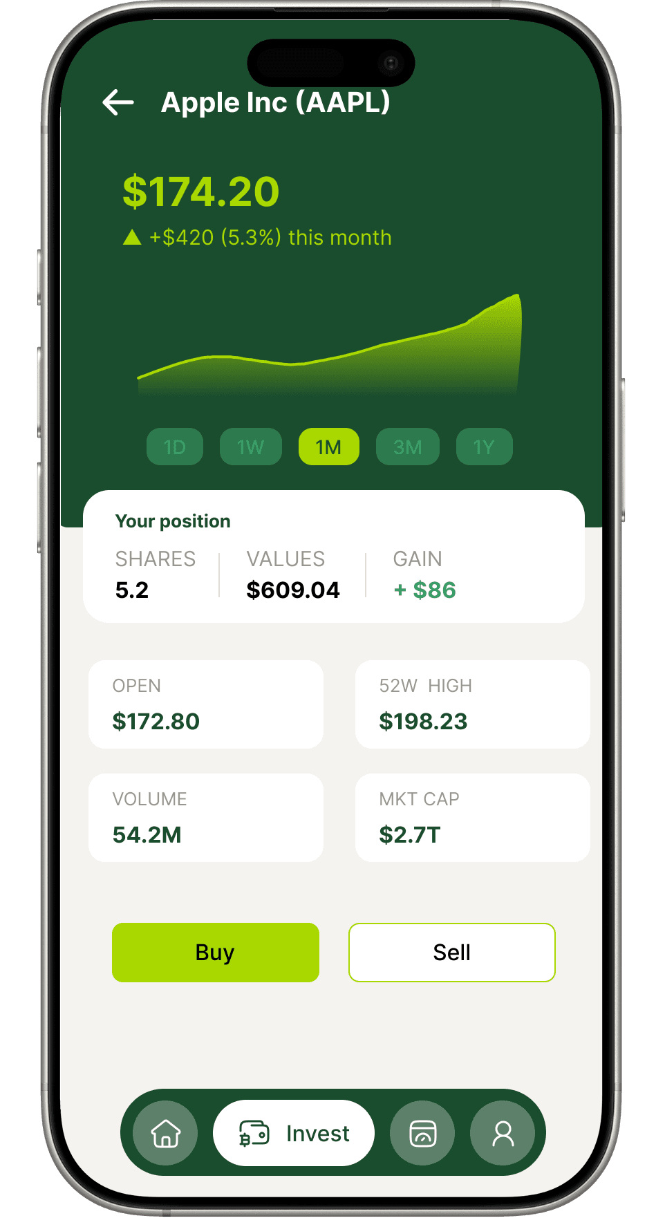
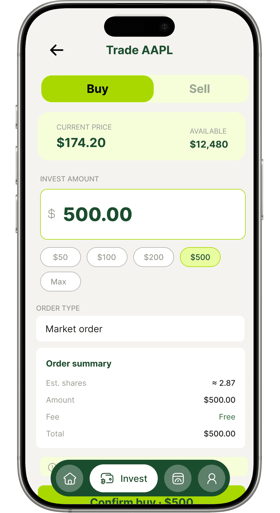
Grow beyond the wallet
Portfolio overview, live charts and a clean buy/sell flow. Designed to make investing feel approachable without stripping out depth.
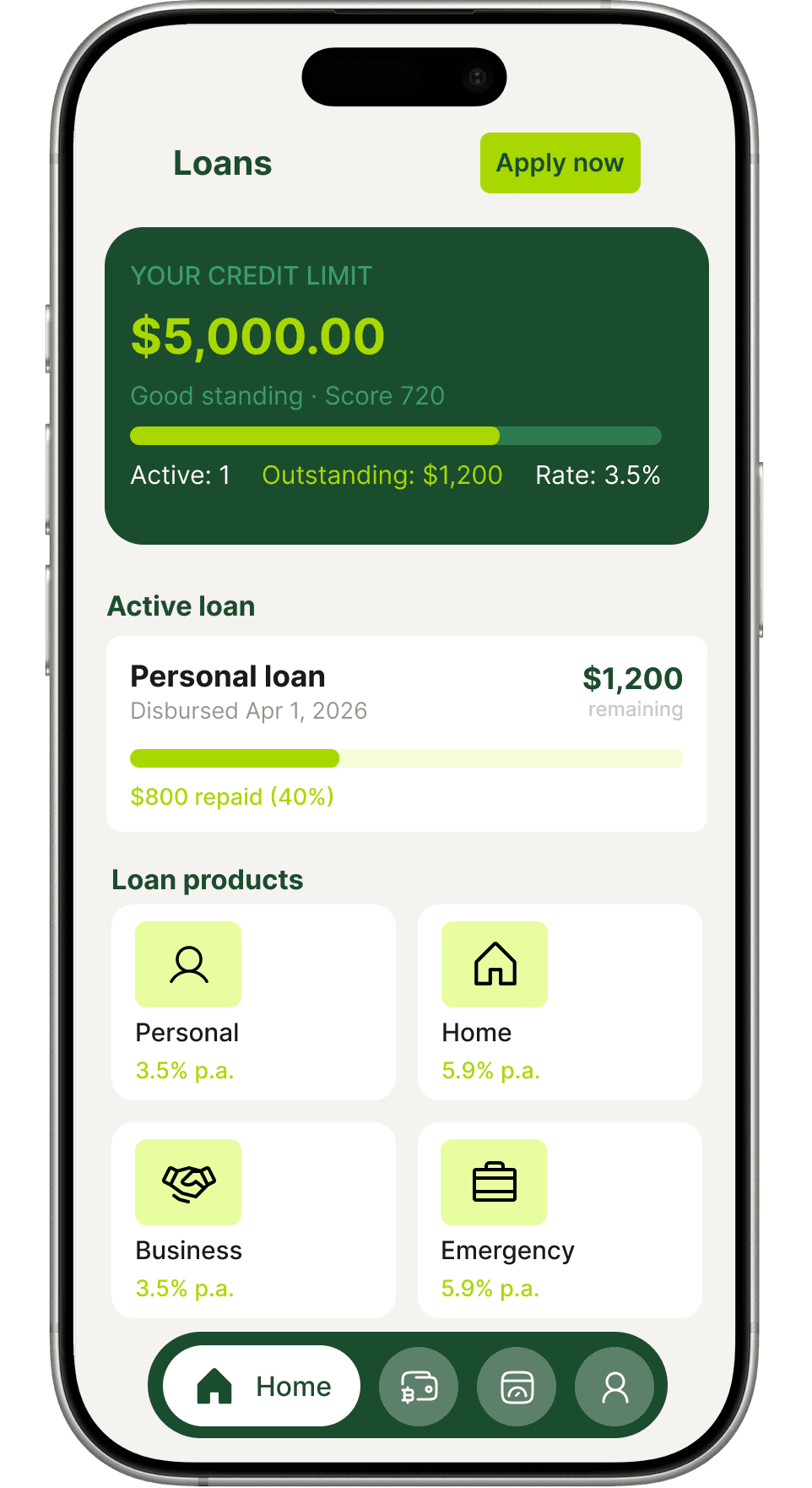
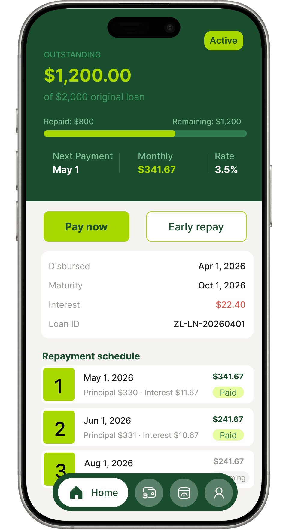
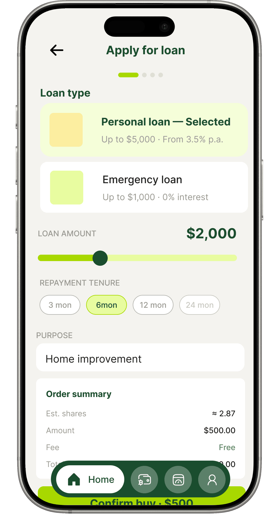
Loans
Credit that's clear and fair
Eligibility, application and repayment schedules in plain language. Users always know what they owe, when it's due and what it costs.
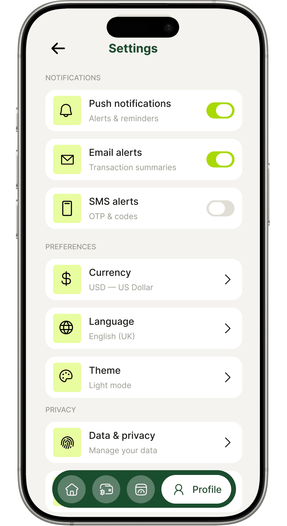
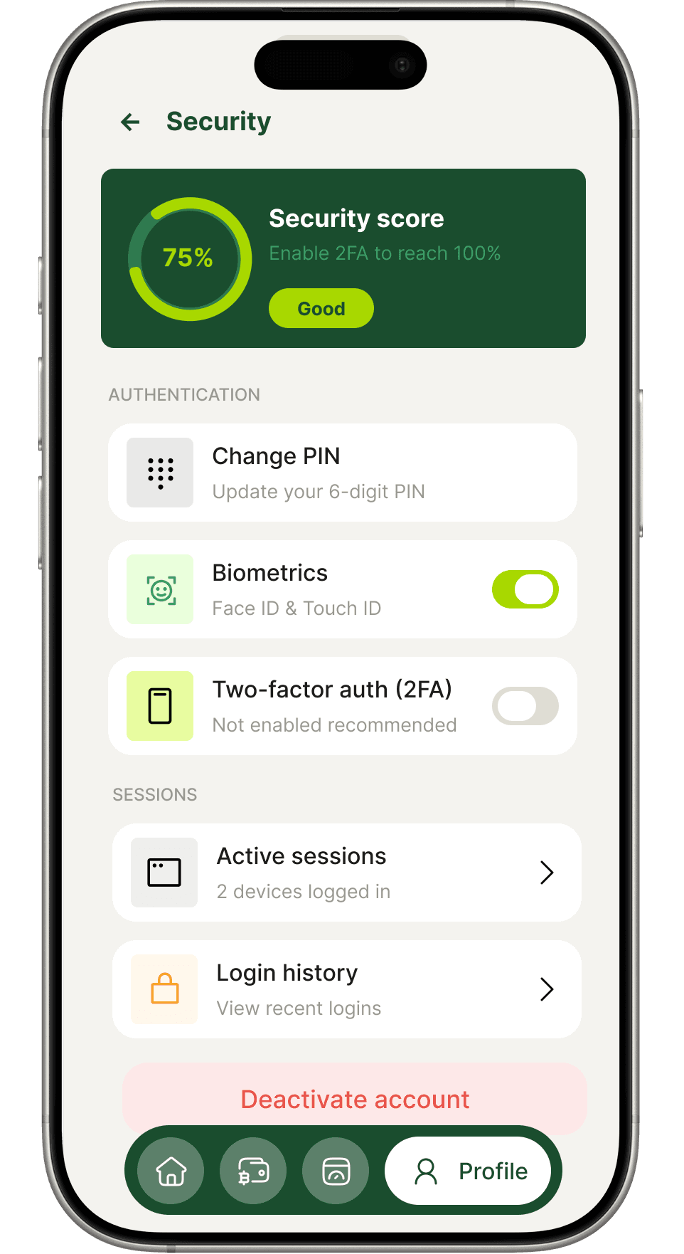
Profile & settings
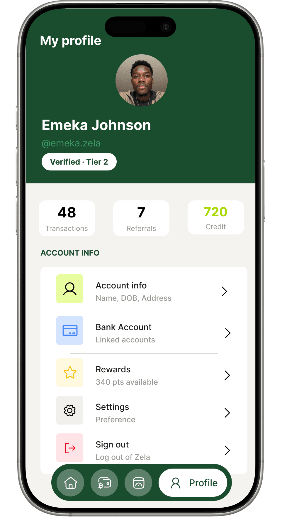
Yours to configure
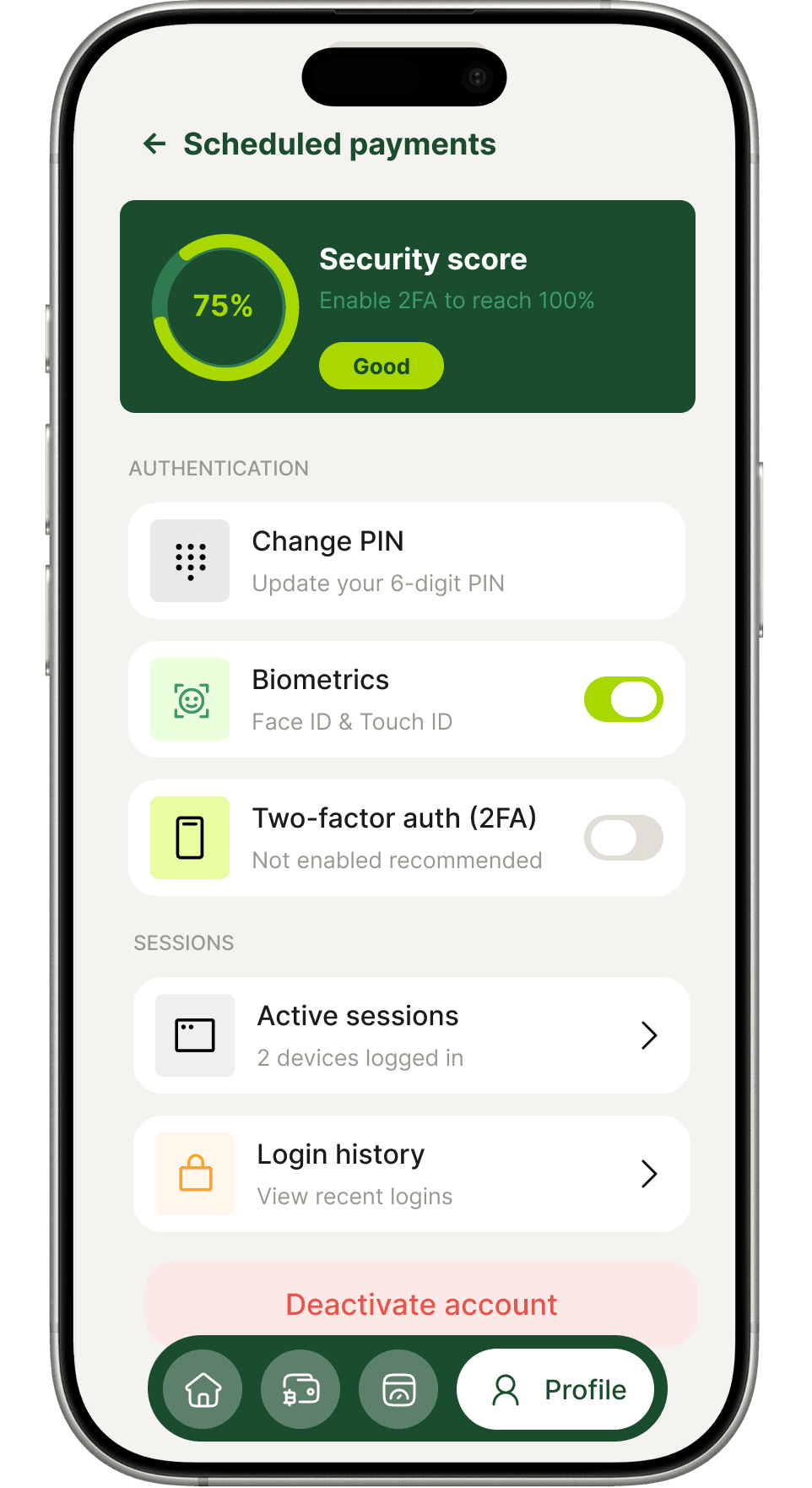
Security score, biometrics, referrals and support — all organised so users can find what they need and trust that their account is protected.
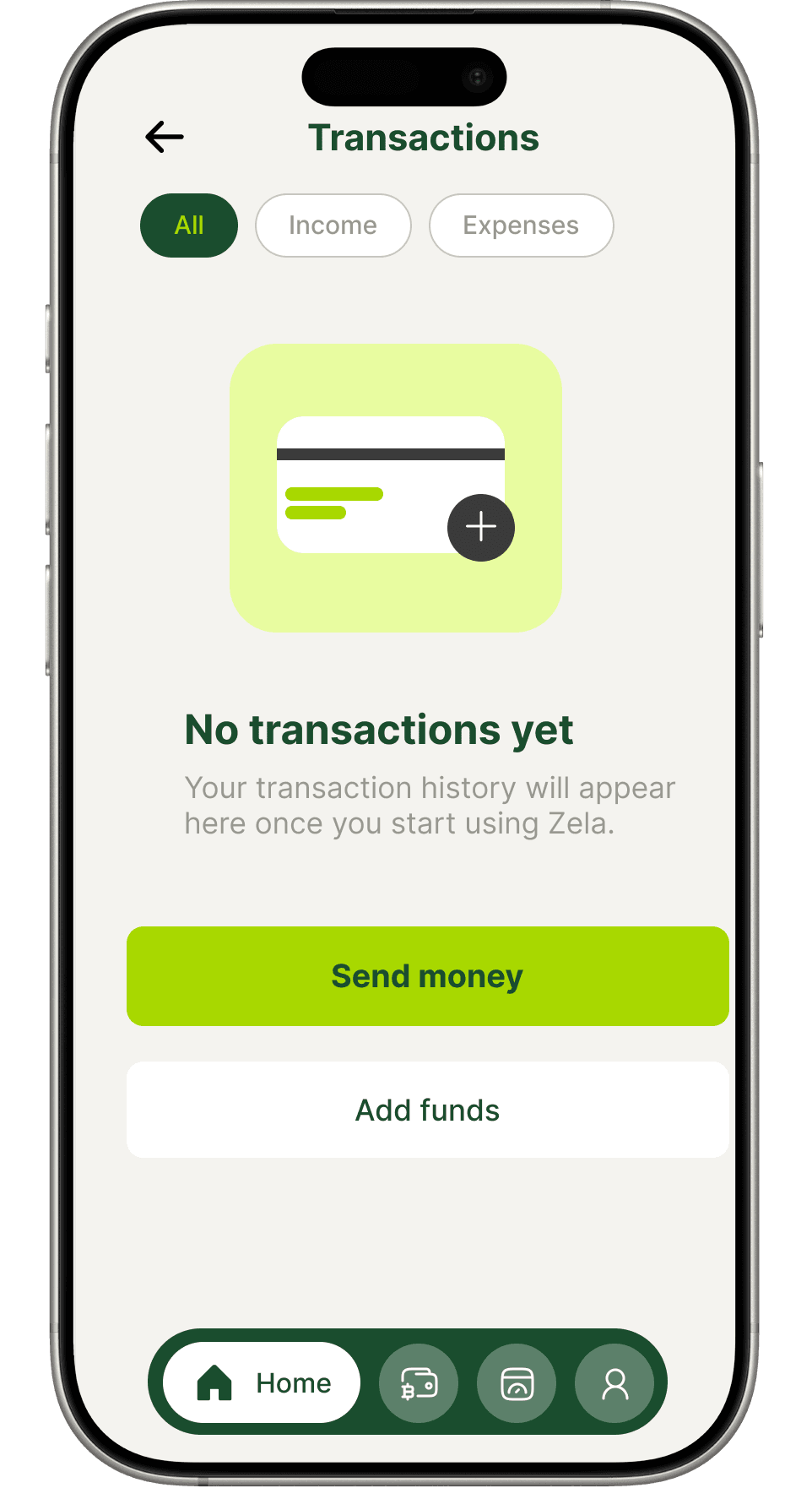
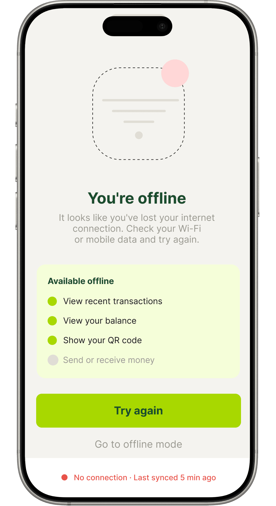
Extras & states
Designed for every moment
Success, empty and offline states handled with care. No screen is an afterthought — every edge case gets the same design attention as the hero flows.
Process
How it was built
From brand identity to every interaction state, a structured design process.
Brand foundation
Logo design, color palette, typography, and component library established before any screen work began.
User journey mapping
Screen design
35 screens built in Figma at 402×874 with auto layout, component frames, and SVG icons throughout.
Motion & prototype
Intro animation created in Jitter. Full prototype linked in Figma showing screen-to-screen navigation.